Calendar An icon of a desk calendar. Cancel An icon of a circle with a diagonal line across. Caret An icon of a block arrow pointing to the right. Email An icon of a paper envelope. Facebook An icon of the Facebook "f" mark. Google An icon of the Google "G" mark. Linked In An icon of the Linked In "in" mark. Logout An icon representing logout. Profile An icon that resembles human head and shoulders. Telephone An icon of a traditional telephone receiver. Tick An icon of a tick mark. Is Public An icon of a human eye and eyelashes. Is Not Public An icon of a human eye and eyelashes with a diagonal line through it. Pause Icon A two-lined pause icon for stopping interactions. Quote Mark A opening quote mark. Quote Mark A closing quote mark. Arrow An icon of an arrow. Folder An icon of a paper folder. Breaking An icon of an exclamation mark on a circular background. Camera An icon of a digital camera. Caret An icon of a caret arrow. Clock An icon of a clock face. Close An icon of the an X shape. Close Icon An icon used to represent where to interact to collapse or dismiss a component Comment An icon of a speech bubble. Comments An icon of a speech bubble, denoting user comments. Comments An icon of a speech bubble, denoting user comments. Ellipsis An icon of 3 horizontal dots. Envelope An icon of a paper envelope. Facebook An icon of a facebook f logo. Camera An icon of a digital camera. Home An icon of a house. Instagram An icon of the Instagram logo. LinkedIn An icon of the LinkedIn logo. Magnifying Glass An icon of a magnifying glass. Search Icon A magnifying glass icon that is used to represent the function of searching. Menu An icon of 3 horizontal lines. Hamburger Menu Icon An icon used to represent a collapsed menu. Next An icon of an arrow pointing to the right. Notice An explanation mark centred inside a circle. Previous An icon of an arrow pointing to the left. Rating An icon of a star. Tag An icon of a tag. Twitter An icon of the Twitter logo. Video Camera An icon of a video camera shape. Speech Bubble Icon A icon displaying a speech bubble WhatsApp An icon of the WhatsApp logo. Information An icon of an information logo. Plus A mathematical 'plus' symbol. Duration An icon indicating Time. Success Tick An icon of a green tick. Success Tick Timeout An icon of a greyed out success tick. Loading Spinner An icon of a loading spinner. Facebook Messenger An icon of the facebook messenger app logo. Facebook An icon of a facebook f logo. Facebook Messenger An icon of the Twitter app logo. LinkedIn An icon of the LinkedIn logo. WhatsApp Messenger An icon of the Whatsapp messenger app logo. Email An icon of an mail envelope. Copy link A decentered black square over a white square.

The secret behind re-branding? Public understanding, expert says

Andrew Turnbull, marketing expert at Robert Gordon University.

Even giants such as British Airways and Coca Cola have experienced a backlash when they have attempted to re-brand.

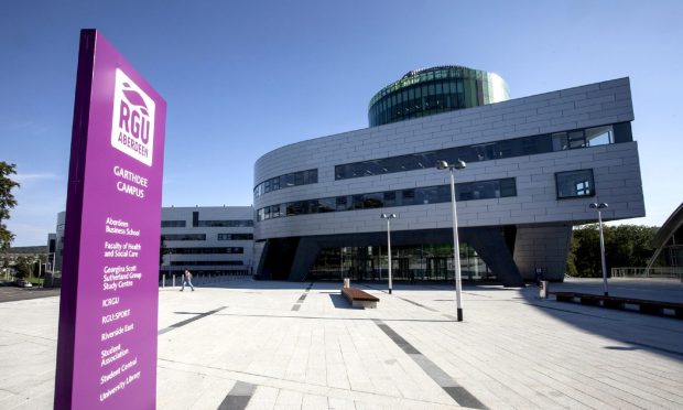
Andrew Turnbull, a senior lecturer in marketing at the Robert Gordon University in Aberdeen, said it was crucial for brand owners to consider what people will relate to, rather than making a change just for the sake of it.

He said there were three obvious examples of re-branding gone wrong in the last 20-30 years.

“British Airways tried to brand their fleet with a series of ethnic tail fins, and very quickly found out the public didn’t like it at all,” he said. “They had to re-brand with more British flag colours.

“The Post Office changed to Consigna, and people quickly questioned that. They quickly changed to the General Post Office, and then to the Post Office.

“Years ago, Coca Cola re-branded and changed the formula. Despite having done numerous tests to make sure they had a wonderful product and all the rest of it, it actually went horribly wrong.”

However, Mr Turnbull said there were plenty of manufacturers and groups who had managed to make successful changes, such as Jif to Cif, and sweeties Marathon to Snickers and Opal Fruits to Starburst.

He added: “You’ve also got the Earl Haig Foundation Scotland. 98% of the population understand the significance of the poppy, so it’s now called Poppyscotland.

“It needs to be levelled entirely in line with public understanding.

“That’s the key thing. Are the public, or the target audience, going to understand what the new brand signifies and means?”

The lecturer suggested Legion Scotland’s name change would create a “degree of consistency” with Poppyscotland, and that the timing of it, so close to Remembrance Day, would maximise attention.