With daffodils bursting into life, spring is the perfect time to brighten up your home’s interior.
Step forward Felicity Stevens, an interior designer and co-founder of Haus Interiors, who is keen to share her simple hints and tips for freshening up your four walls.
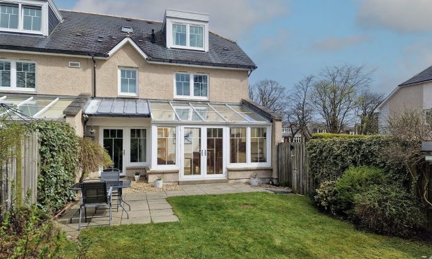
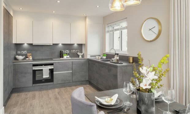
Felicity, who has worked with Cala Homes on its The Macrae at Oldfold Village, Milltimber and The Westwood apartment at Craibstone Estate, tells the Press and Journal that a spring home make-over is easier than you think.

What colours are in this year?
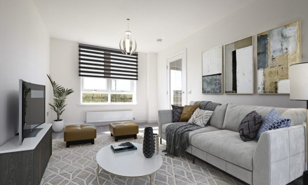
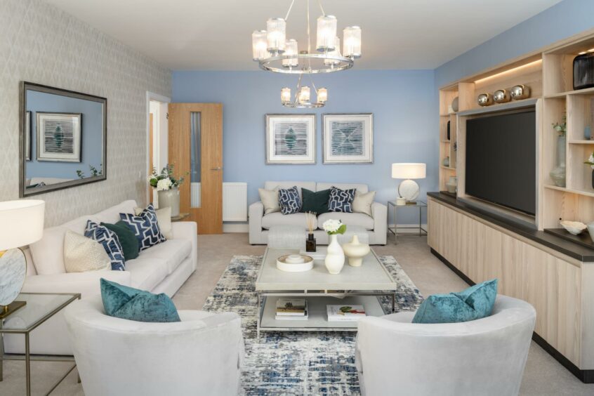
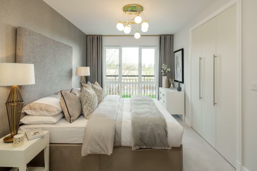
Look out for the return of calm and neutral colour palettes, it’s a combination that will never go out of style. Think forms of black, white and grey with muted colours which will work in almost every room.
However, that’s not to say bright colours won’t be making an appearance, which is certainly the case with the Pantone colour of the year. Very Peri is quite an acidic lilac and considering the amount of time we spend in our homes, introducing this shade will certainly brighten up your room and your mood! Simple ways to include this would be a feature wall or accessories like cushions, a rug or wall art.
I’m also predicting that green (all shades), oranges, rust, coral, sunflower and pink shades will be popular, so don’t be afraid to add a pop of colour to your home.
In terms of furniture styles, what can we expect?
I’m delighted that rounded shaped furniture will remain big this year. Last year, curved furniture was crowned contemporary and on-trend, and I’ve really enjoyed featuring it in showhomes as it becomes a real feature piece. Pay attention to tables, lamps, pouffes and sofas especially.
It’s also predicted that retro furniture styles will continue to impress – think of ’60s and ’70s styles, but also ’90s street-art patterns coming through in art and rugs. Don’t be afraid to mix the styles and put your own stamp on it.
What will we see more of this year?
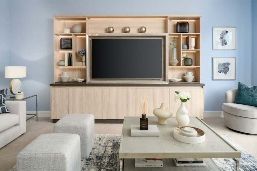
I think we’ll definitely be adding more nature-inspired textures into our homes. There are some real show-stopping furniture styles in materials such as cork, leather and wood that will add something different to your room. Paired with nature-inspired wall coverings, you can bring the outdoors in.
What will never go out of style?
Texture. I always recommend adding wallpaper and textiles that have tactile surfaces, a room is never complete without this element. Go for textured fabrics, textured wallpaper or wallpaper that creates the illusion of texture. It’s key to helping make that space look “finished”.
Do you have any simple tips for those looking to refresh their home?
Where do I start? There are so many easy ways to freshen up your home. A quick and cost-effective way is to add new smells – diffusers make a huge difference and a new smell will make your house feel completely different when you walk through the door. I enjoy having one scent downstairs and a different one upstairs.
Update your faux flowers and plants as they can get tired over time and just collect dust. If you want to invest money in something worthwhile, I’d recommend this, as they can make a cold corner feel warm.
Or incorporate a new feature paint to create an impact – if the room currently has a really light paint, choose to make a wall darker with a rich paint, sometimes doing something opposite to what you have already gives it a new feel and a much welcomed fresh take.
What trends are you incorporating into your plans for the new showhomes at Craibstone Estate South?
The Pantone colour of the year is PANTONE 17-3938 Very Peri and it is quite an acidic lilac/violet colour. We are taking inspiration from the Pantone colour of the year with purple hews in The Lowther showhome, but we will be putting an opulent twist on the colour palette.
You will see a deeper purple, which derives from Very Peri, and is much more apt for the look and feel we are looking to achieve with Cala. You will see this colour feature heavily in the lounge, where we are incorporating a deep purple sofa, and hand-painted artwork which includes a more vivid version of the Very Peri tone you see from Pantone.
For more information visit Cala Home’s website.