Calendar An icon of a desk calendar. Cancel An icon of a circle with a diagonal line across. Caret An icon of a block arrow pointing to the right. Email An icon of a paper envelope. Facebook An icon of the Facebook "f" mark. Google An icon of the Google "G" mark. Linked In An icon of the Linked In "in" mark. Logout An icon representing logout. Profile An icon that resembles human head and shoulders. Telephone An icon of a traditional telephone receiver. Tick An icon of a tick mark. Is Public An icon of a human eye and eyelashes. Is Not Public An icon of a human eye and eyelashes with a diagonal line through it. Pause Icon A two-lined pause icon for stopping interactions. Quote Mark A opening quote mark. Quote Mark A closing quote mark. Arrow An icon of an arrow. Folder An icon of a paper folder. Breaking An icon of an exclamation mark on a circular background. Camera An icon of a digital camera. Caret An icon of a caret arrow. Clock An icon of a clock face. Close An icon of the an X shape. Close Icon An icon used to represent where to interact to collapse or dismiss a component Comment An icon of a speech bubble. Comments An icon of a speech bubble, denoting user comments. Comments An icon of a speech bubble, denoting user comments. Ellipsis An icon of 3 horizontal dots. Envelope An icon of a paper envelope. Facebook An icon of a facebook f logo. Camera An icon of a digital camera. Home An icon of a house. Instagram An icon of the Instagram logo. LinkedIn An icon of the LinkedIn logo. Magnifying Glass An icon of a magnifying glass. Search Icon A magnifying glass icon that is used to represent the function of searching. Menu An icon of 3 horizontal lines. Hamburger Menu Icon An icon used to represent a collapsed menu. Next An icon of an arrow pointing to the right. Notice An explanation mark centred inside a circle. Previous An icon of an arrow pointing to the left. Rating An icon of a star. Tag An icon of a tag. Twitter An icon of the Twitter logo. Video Camera An icon of a video camera shape. Speech Bubble Icon A icon displaying a speech bubble WhatsApp An icon of the WhatsApp logo. Information An icon of an information logo. Plus A mathematical 'plus' symbol. Duration An icon indicating Time. Success Tick An icon of a green tick. Success Tick Timeout An icon of a greyed out success tick. Loading Spinner An icon of a loading spinner. Facebook Messenger An icon of the facebook messenger app logo. Facebook An icon of a facebook f logo. Facebook Messenger An icon of the Twitter app logo. LinkedIn An icon of the LinkedIn logo. WhatsApp Messenger An icon of the Whatsapp messenger app logo. Email An icon of an mail envelope. Copy link A decentered black square over a white square.

This is how paint colour in your home can affect your mood

Adding a pop of colour to your room can make a big difference.

The colours on our walls at home affect how we feel much more than we realise, according to Marianne Shillingford, creative director at Dulux.

“We use colour if we’re going out for a wedding or a big celebration, we’ll put on more colour than we normally would if we went into the office,” Shillingford says.

“So we use colour all the time as a language to express the way we feel, or how we want to feel. And in our homes, it is more important than anything to get it right.”

This is what Shillingford suggests you should do to evoke different moods using paint…

To create a stimulating environment…

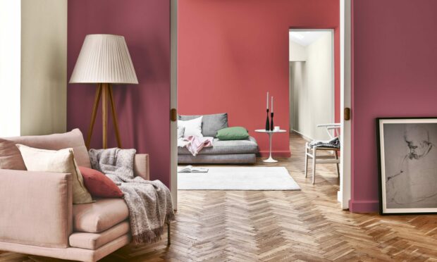
“Red is the colour that has the longest visual wavelength – it draws your attention. Red has long been associated with eating rooms, restaurants and dining rooms, because it’s the most stimulating colour. It stimulates conversation, it stimulates our tastebuds, it makes everything taste better and sweeter,” says Shillingford, who recommends Fitzrovia Red or Pugin Red from the Dulux Heritage range.

The colour of nature brings a fresh flavour to a room. Photos by PA.

To evoke calmness…

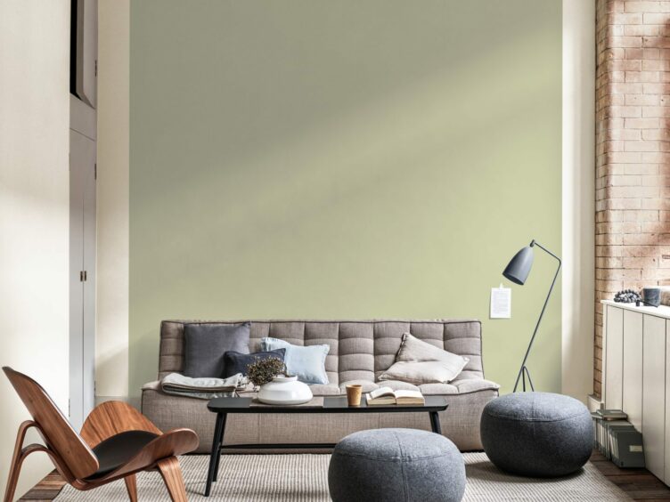
“Creating calm in any space is about shorter wavelength colours – like blues and greens, that reconnect us with nature,” says Shillingford.

“They appear slightly further away from us, so when we paint them on the walls, it makes the space feel less enclosed and more connected with the outdoors. It’s a fact that being in nature can help soothe a troubled soul, so the colours of nature – whether they are soft, organic blues, grass greens or the colours of raw organic materials – they’re not overwhelming, which I think is perfect if you’ve got children and you’re trying to juggle work and family life.”

It’s easier than you think to freshen up tired looking rooms.

For a happy place to be…

“We often think the most joyful colour is yellow, because it reminds us of the sunshine, the first flowers of spring, yellow daffodils, buttercups, primroses. It also reminds us of hopeful things that happen in spring, like harvest corn. It’s uplifting, and it’s quite a common colour for nurseries.

“Pink is another one. We’ve reclaimed pink from its associations with little girls and Barbie – we can all enjoy pink, it’s a gentle flash of joy.”

Choosing the right colour scheme can brighten up your home and your mood.

To evoke feelings of sleepiness…

“Dark blues and deep greens are perfect for helping you sleep,” says Shillingford.

“Some people do the whole wrap of a room and I think it can look lovely, but I get the feeling people are starting to paint out (sections of a room). You could split your bedroom into two different spaces, say if you painted up the wall on to the ceiling and down the other side, to create a sort of canopy around your bed in a slightly deeper colour.”

Blue can evoke a sense of calmness in a room.

To inspire motivation or creativity…

“Get the energy levels up using a strong colour, but if you use too much of a strong colour you can become slightly agitated,” says Shillingford.

“So use blocks of colour, like colour blocking around a picture, colour blocking around a sofa, or a big shape (above a sofa).”

Conversation