Calendar An icon of a desk calendar. Cancel An icon of a circle with a diagonal line across. Caret An icon of a block arrow pointing to the right. Email An icon of a paper envelope. Facebook An icon of the Facebook "f" mark. Google An icon of the Google "G" mark. Linked In An icon of the Linked In "in" mark. Logout An icon representing logout. Profile An icon that resembles human head and shoulders. Telephone An icon of a traditional telephone receiver. Tick An icon of a tick mark. Is Public An icon of a human eye and eyelashes. Is Not Public An icon of a human eye and eyelashes with a diagonal line through it. Pause Icon A two-lined pause icon for stopping interactions. Quote Mark A opening quote mark. Quote Mark A closing quote mark. Arrow An icon of an arrow. Folder An icon of a paper folder. Breaking An icon of an exclamation mark on a circular background. Camera An icon of a digital camera. Caret An icon of a caret arrow. Clock An icon of a clock face. Close An icon of the an X shape. Close Icon An icon used to represent where to interact to collapse or dismiss a component Comment An icon of a speech bubble. Comments An icon of a speech bubble, denoting user comments. Comments An icon of a speech bubble, denoting user comments. Ellipsis An icon of 3 horizontal dots. Envelope An icon of a paper envelope. Facebook An icon of a facebook f logo. Camera An icon of a digital camera. Home An icon of a house. Instagram An icon of the Instagram logo. LinkedIn An icon of the LinkedIn logo. Magnifying Glass An icon of a magnifying glass. Search Icon A magnifying glass icon that is used to represent the function of searching. Menu An icon of 3 horizontal lines. Hamburger Menu Icon An icon used to represent a collapsed menu. Next An icon of an arrow pointing to the right. Notice An explanation mark centred inside a circle. Previous An icon of an arrow pointing to the left. Rating An icon of a star. Tag An icon of a tag. Twitter An icon of the Twitter logo. Video Camera An icon of a video camera shape. Speech Bubble Icon A icon displaying a speech bubble WhatsApp An icon of the WhatsApp logo. Information An icon of an information logo. Plus A mathematical 'plus' symbol. Duration An icon indicating Time. Success Tick An icon of a green tick. Success Tick Timeout An icon of a greyed out success tick. Loading Spinner An icon of a loading spinner. Facebook Messenger An icon of the facebook messenger app logo. Facebook An icon of a facebook f logo. Facebook Messenger An icon of the Twitter app logo. LinkedIn An icon of the LinkedIn logo. WhatsApp Messenger An icon of the Whatsapp messenger app logo. Email An icon of an mail envelope. Copy link A decentered black square over a white square.

5 tips for choosing paint colours

Post Thumbnail

Colour can be a bit of a minefield if you’re not confident about using it in your home, but there are ways to make the process easier.

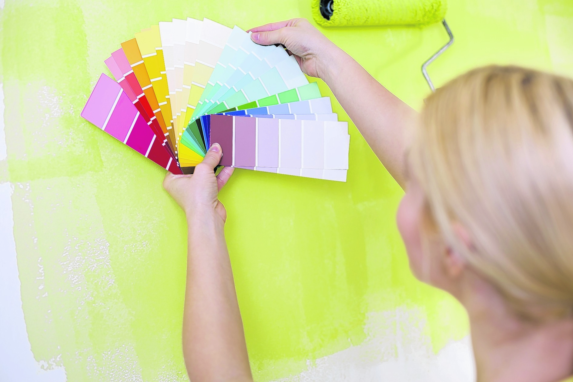
1. It’s not advisable to use a paint colour you don’t know without trying it first – don’t rely on printed colour cards, colours on computer screens, the colour on the tin, or the colour of the wet paint, as these can be misleading. Occasionally, colour cards are painted and these are, of course, more reliable than printed ones.

2. The only way to get an accurate idea of what a particular colour will look like in a particular room is to paint a little on the wall, preferably all the walls, and let it dry. Then live with it for at least a few days so you can see it in different lights and at different times of the day. A colour can look different in natural light and artificial light, and even in different types of artificial light.

3. Be careful when buying white emulsions, as some pure brilliant whites are more cream than white. Again, it’s advisable to try a little first because there’s no way of knowing which pure brilliant whites aren’t very white, unless you’re familiar with them. If a paint is just called ‘white’, it’s probably cream, but this isn’t always the case.

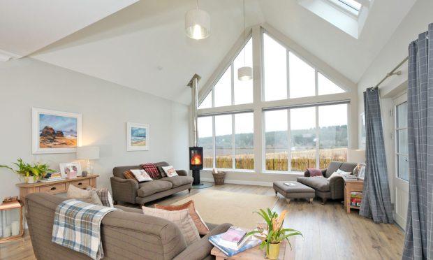
4. You may want to take account of the way a room faces when choosing paint colours. North-facing rooms can be a challenge because the light is cold – steer clear of colours with a grey or green base and consider yellows and creamy neutrals for a lighter, cheerier feel. Sunny south-facing rooms are much easier, as most colours work well. Rooms that face west are also easy to decorate – whites work particularly well – whereas east-facing rooms suit blues and greens best.

5. Other things can affect your choice of wall colour, such as the colour of the flooring, window treatments, furniture and accessories,
if you predominantly use the room at a certain time of day, and whether
you want to create a dark and moody or light and airy feel, or something in between. If you’re not sure what you want, feature walls are a good way to enjoy a limited amount of colour in a room and aren’t difficult to repaint if you change your mind.