I’m not sure it strictly counts as a symptom of Covid-19, but a pronounced swelling in the trust people put in the media has certainly been a notable side effect of the virus.
Bizarre claims that “mainstream” journalists were complicit in some vast global conspiracy to con the public about a non-existent health threat remain a staple of some online comment threads.
Despite them – or perhaps more likely because of them and the confusing swirl of false information they were a part of – the health crisis spurred a notable uptick in the proportion saying established news outlets were where they turned first for information.
It was an almost global phenomenon and a welcome one for institutions founded on trust, like the P&J.
The latest studies though suggest it risks being temporary, the recovery from damage caused by toxic political debates and ethics scandals in the national press not much outlasting the crisis itself.
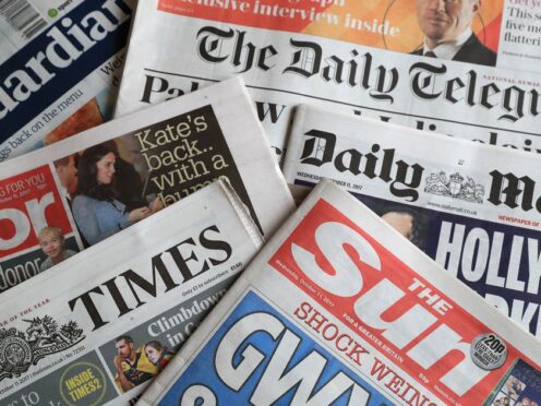
Just 35% of UK citizens say they trust journalists. It put the UK just 6% above bottom-placed Russia, and the third least trusted of those analysed.
Is a lack of representation worsening a crisis of trust in journalism?https://t.co/lblKda7TcL
— Press Gazette (@pressgazette) May 25, 2022
We are determined that will not be the case for us. We are doing our best to understand what reopened so many eyes to the value of a dependably honest source of information and build on it.
Turning official data into digestible information
I had plenty of time to think about all this a fortnight ago when my unlikely 28-month run of Covid dodging came to an abrupt halt and I found myself poleaxed with almost every one of the better-known symptoms and feeling too rotten even to meet my deadline for the last of these columns.
At least I was not alone – around 2,360 other people in Scotland got it that day too.
I know that because I looked it up on one of the P&J’s rolling online trackers of some of the key measures of the pandemic’s progress and impact – everything from deaths and hospitalisation rates to the impact on unemployment or pollution levels.
As people sought clarity at the bewildering height of the initial outbreak, these pages were among the most visited on our website.
Coronavirus in Scotland – track the spread with these charts
They were popular because they distilled the vast swathes of official data into a digestible and meaningful summary of the state of play – and allowed readers to draw their own conclusions.
In essence no different to what we have always done with the other information we gather in all forms and turn into stories – but a hugely valuable addition to that traditional content and one which played a large part in boosting public trust.
So we are committed to doing more of the same, wherever it is most useful to you.
Over the course of this century, public authorities have bowed to pressure to make more and more information available about how well they are performing, the value they are providing for the billions of pounds we hand over between us each year in tax.
But their definition of “available” is very different to most people’s, including ours.
Specialist journalists won trust of readers
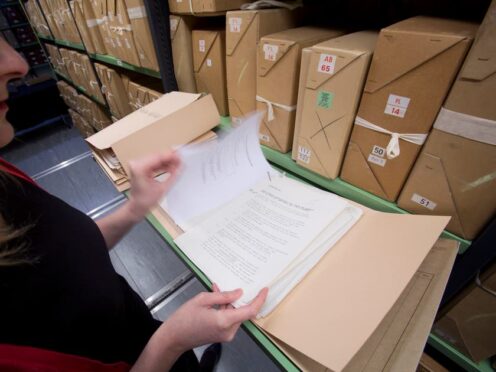
That is why we have an entire team of specialist journalists tasked with finding the hidden dark corners of obscure webpages where the data is dumped in impenetrable formats and making it comprehensible to someone who doesn’t know their R-number from their elbow.
Our work to “democratise” Covid data won us awards – but far more importantly it won us the trust of countless readers who came to rely on it to make sense of what was unfolding around them.
Now we have turned our attention to the bigger picture in the NHS as it battles to get to grips with the repercussions of two years on a war-footing.
Whether you want to know how long you are likely to wait for cancer treatment or the likelihood of being stuck on a trolley in A&E for hours, the new trackers can tell you.
They also allow you to keep tabs on lots of other measures, including how many operations are being cancelled, how many beds are blocked.
Of course we’ll be studying the numbers very closely too, investigating any significant changes, letting you know the results of our digging and fighting on your behalf for the policy changes needed to start the lines heading in more encouraging directions – hopefully not just on the graphs for NHS performance but those charting trust in the media too.


Conversation