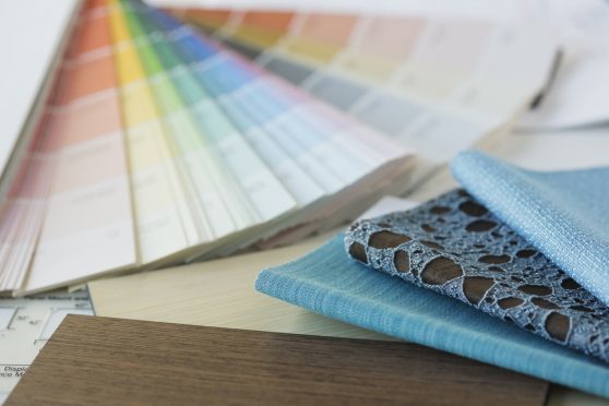
How many of us give thought to how the rooms in our house make us feel? Or how decorating them using specific colours can actually change our mood? Probably not many.
But actually, putting a bit more thought into the colours you choose for each of your rooms could help you get the most out of them. So, if you are planning to redecorate or update your upholstery, take a minute to think to yourself, “how do I want this room to make me feel?”
The experts at CALA Homeshave listed some of the most popular colours for interior decorating and design, explaining where and how they can best be used.
Blue – serenity, intelligence, protection, clear-thinking
Studies have shown that students exposed to the colour blue before sitting exams achieved greater results than those who were not, signifying blue has a positive effect on the brain when it comes to work.
Blue can also have a cooling impact and lowers blood pressure, so for a room where you want to relax, some blue can be a welcome addition, depending on the shade.
Rooms: Bedrooms, living rooms and offices
Green – nature, balance, wealth
Due to its calming nature, green is utilised most often in bedrooms. It’s also said to help ward away nightmares.
It’s considered the most restful colour for the eye and can help people de-stress and relax – possibly because it evokes the colours of the outdoors and nature.
However, too much green can make people feel sluggish, so it’s probably best avoided in your home office.
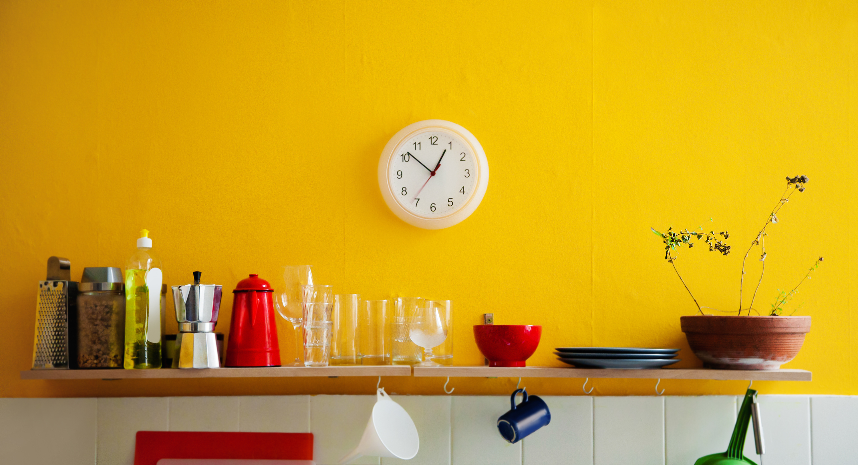 Yellow – energy, happiness, attention, welcoming
Yellow is generally considered a happy, uplifting colour. Using this in your home can make people instantly more positive and full of life. It also creates a welcoming, spacious feeling in halls and entryways.
However, babies also seem to cry more if they are in a yellow room and too much yellow can create anger and frustration, so it’s best used as an accent colour.
Rooms: Kitchens, dining rooms and bathrooms
Orange – warmth, sociable, reassurance, creative
Orange makes people want to ‘get up and go’ so it’s ideal for rooms that have a lot of life in them – it also works very well as a colour of warmth in living rooms and dining rooms.
Ancient cultures also believed that orange had a positive effect on the respiratory system and helped lift energy levels.
Rooms: Kitchens, dining rooms, home gym
Red – passion, optimism, adventure, intimate
The colour of luxury and intimacy, red is a daring hue that is guaranteed to spark romance. It also raises the energy levels in a room, as well as blood pressure and heart rate.
Red is used a lot in the logos and branding of food and drink companies because of its effect on appetite.
Rooms: Bedrooms and dining rooms
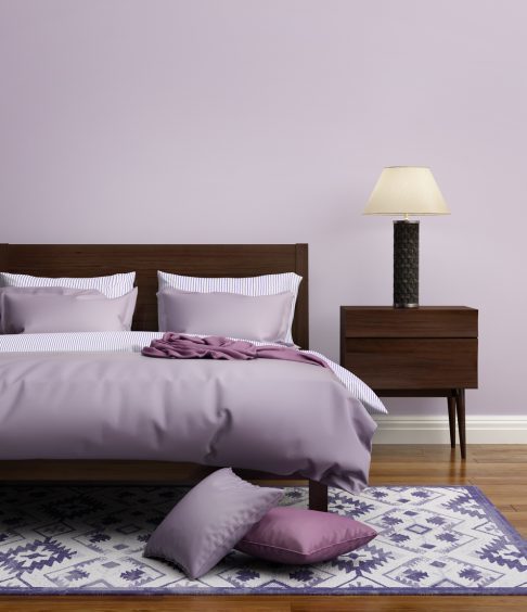
Purple – regal, dramatic, restful, spiritual
The colour of royalty and opulence, a deep purple (such as an aubergine shade) brings drama to a room and makes it feel very sophisticated.
Lighter lilacs are great for spirituality and restfulness, and manage to avoid the coolness of blues.
Whether used as a main colour or as accents, purples can be a dramatic or relaxing option.
Rooms: Bedrooms and bathrooms
 Pink – calm, love, peace, playfulness
Pink is known for its calming influences, inspiring soothing feelings of peace and love.
It also has a playfulness and youthfulness that many other colours lack.
Rooms: Bedrooms
White – space, balance, cleanliness
White can often seem like a basic colour, but it gives you a blank canvas to work with. The base of white creates a lot of space and neutrality to work with – and it gives the room a light and clean feeling.
Quite often a white room is reminiscent of a spa – the purpose of which is to relax and soothe.
Rooms: Bedrooms