Calendar An icon of a desk calendar. Cancel An icon of a circle with a diagonal line across. Caret An icon of a block arrow pointing to the right. Email An icon of a paper envelope. Facebook An icon of the Facebook "f" mark. Google An icon of the Google "G" mark. Linked In An icon of the Linked In "in" mark. Logout An icon representing logout. Profile An icon that resembles human head and shoulders. Telephone An icon of a traditional telephone receiver. Tick An icon of a tick mark. Is Public An icon of a human eye and eyelashes. Is Not Public An icon of a human eye and eyelashes with a diagonal line through it. Pause Icon A two-lined pause icon for stopping interactions. Quote Mark A opening quote mark. Quote Mark A closing quote mark. Arrow An icon of an arrow. Folder An icon of a paper folder. Breaking An icon of an exclamation mark on a circular background. Camera An icon of a digital camera. Caret An icon of a caret arrow. Clock An icon of a clock face. Close An icon of the an X shape. Close Icon An icon used to represent where to interact to collapse or dismiss a component Comment An icon of a speech bubble. Comments An icon of a speech bubble, denoting user comments. Comments An icon of a speech bubble, denoting user comments. Ellipsis An icon of 3 horizontal dots. Envelope An icon of a paper envelope. Facebook An icon of a facebook f logo. Camera An icon of a digital camera. Home An icon of a house. Instagram An icon of the Instagram logo. LinkedIn An icon of the LinkedIn logo. Magnifying Glass An icon of a magnifying glass. Search Icon A magnifying glass icon that is used to represent the function of searching. Menu An icon of 3 horizontal lines. Hamburger Menu Icon An icon used to represent a collapsed menu. Next An icon of an arrow pointing to the right. Notice An explanation mark centred inside a circle. Previous An icon of an arrow pointing to the left. Rating An icon of a star. Tag An icon of a tag. Twitter An icon of the Twitter logo. Video Camera An icon of a video camera shape. Speech Bubble Icon A icon displaying a speech bubble WhatsApp An icon of the WhatsApp logo. Information An icon of an information logo. Plus A mathematical 'plus' symbol. Duration An icon indicating Time. Success Tick An icon of a green tick. Success Tick Timeout An icon of a greyed out success tick. Loading Spinner An icon of a loading spinner. Facebook Messenger An icon of the facebook messenger app logo. Facebook An icon of a facebook f logo. Facebook Messenger An icon of the Twitter app logo. LinkedIn An icon of the LinkedIn logo. WhatsApp Messenger An icon of the Whatsapp messenger app logo. Email An icon of an mail envelope. Copy link A decentered black square over a white square.

Dulux Colour of the Year 2022 Bright Skies is a breath of fresh air

For the 19th year in a row, Dulux has brought out a Colour of the Year and 2022's is Bright Skies.

The new year will bring with it a desire for a fresh start and a wave of hope and optimism, according to trend experts brought together by Dulux.

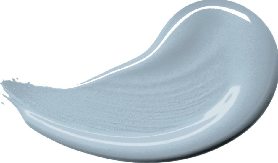
With this in mind, the paint brand has announced that its Colour of the Year for 2022 is Bright Skies™, an airy light blue that aims to capture the hopeful mood of the moment and hints at new beginnings.

Bright Skies has been created to capture the new mood of optimism and hope.

For the 19th year in a row, Dulux assembled leaders in design, fashion, colour and the built environment to consider the trends, innovations and events that will impact the way we live and work.

Good for the soul

The colour experts at Dulux then distilled the findings into a single colour – and supporting palettes – that encapsulates this mood.

The result is Bright Skies™, a colour that, says Dulux, “can bring any living space to life and is good for the soul – a true breath of fresh air”.

With millions of people now adopting hybrid home and office working patterns, there is a need for colour that is flexible and open, to empower this multi-purpose lifestyle and the demands we put on our spaces.

Bright Skies is a light, airy blue, created especially for 2022.

Marianne Shillingford, creative director of Dulux UK, says: “Right now, people want to feel revitalised and enjoy the freedoms that are returning to them, to look out and bring in new ideas. What better inspiration can we take than the endless skies around us?

“It is widely known that nature makes us feel better and taking steps to bring the outside in enhances our sense of wellbeing.

“So whether we are working or relaxing, creating or exercising, it is essential to have a space that reflects the optimism and desire for a fresh, new start that is top of the agenda for the year ahead.

Freedom and endless blue sky were among the themes discussed in the creation of Bright Skies as Colour of the Year for Dulux.

“However, Bright Skies™ is not about idle day-dreaming. It is about turning those dreams into reality and forging ahead with the changes that we want to make.

“This is why the Dulux Colour of the Year 2022 and its supporting palettes are practical, open and flexible to all kinds of requirements.”
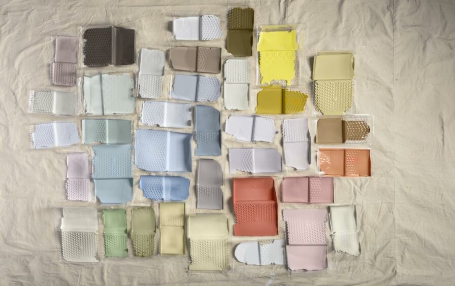
The four supporting colour palettes for Bright Skies are Greenhouse, Salon, Studio and Workshop.

Colour palettes

Bright Skies™ is supported by these four colour palettes, for decorating projects in every kind of room:

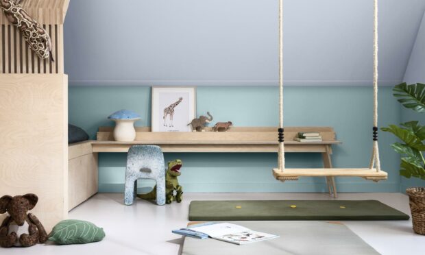
  • Greenhouse is full of fresh greens and blues that are the perfect backdrop for plants and natural materials such as bark or cork.
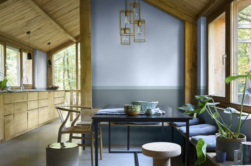
  • Salon is “an enabler of fresh ideas and creative thinking” which is “consciously pale and soft, for those who want a room, or a home, that’s ready for anything”.
  • Studio spaces are “subtle and inspiring” and “seek to soothe, with a mix of pale pinks, reds and oranges”.
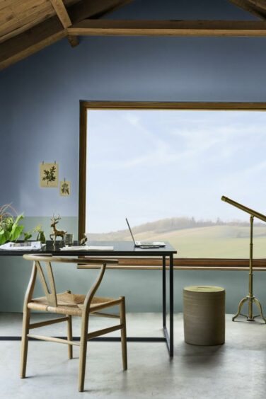
  • The Workshop palette “allows people to create adaptable spaces” for example creating a home office and are “light and positive colours that make the functional fun”.
The Greenhouse palette’s blues and greens provide a harmonising backdrop for plants and natural materials.

Heleen van Gent, head of the AkzoNobel Global Aesthetics Centre, says: “Over the past 19 years, we’ve seen a dramatic shift from a concentration on brighter tones to an emphasis on neutrals.

“This year, however, vibrant colours and light tones are re-emerging – a reflection, perhaps of our need for positivity and a fresh approach.

“After a spell of feeling shut in, we crave expansion – the great outdoors. The 37 curated colours in this year’s collection help to make it easy to choose on-trend shades.”