
House style was a thing largely unknown to readers, but it used to be almost biblical in reverence for newspapers.
Basically, you want the paper (or website now) to be uniform.
English is a tangled web of contradictions and usages, all of which, arguably, can be correct. But your publication has to do them all one way, across the board, so to not confuse and alienate readers.
Writers and sub-editors (when there were many of them, unlike now) had to know which way we did them, and that’s where the house style manual came in.
Some things in the manual were slightly odd. The noble ampersand (&), with a lineage all the way back to ancient Latin, was banned in the Courier until the late 1990s for unclear reasons.
That one was a bit of an issue for me writing regularly about the R and A, as I used to have to style it. When I was finally allowed to “R&A” after many years of complaint – it was how they styled themselves, after all – it felt like victory.
One house style I’ve always held to, and still do, is not everything is good enough to be a championship. One of the late directors of this company was particularly – and correctly – strident about this, telling off me or the subs should we slip.
The Open Championship, the Amateur Championship, the US Open Championship, the PGA Championship, the Boys Championship, they were all okay.
The Masters, however, is not a championship, and therefore the winner is not a champion. Neither is or are any normal tour event like the “Travelers Championship” or even the Alfred Dunhill Links Championship.
The Six Nations Championship? Well, okay, we’ll give you that one.
The URC – great for headlines, but looks a little odd
This is the United Rugby Championship 🏉
Welcome. Failte. Benvenuto. Croeso. Welkom. Wamkelekile!#URC pic.twitter.com/O5pURUloGR
— PRO14 RUGBY (@PRO14Official) June 15, 2021
Nowadays of course, almost everything is a championship. Including the United Rugby Championship (URC) which is the new name for the Guinness PRO14.
I’m all for changing the name of that competition. Despite the ease of inserting it into copy and headlines, PRO14 always looked sort of clumsy to me. There was also the problem that the number of teams competing kept changing.
But the new name, equally easily turned into an acronym, isn’t great either. It looks a little bit too much like UFC, for me the low point of sporting evolution as it is basically fighting-in-a-cage-with-virtually-no-rules.
And I’m not sure URC is really a championship. It seems likely this is the new South African input. It matches the infantile one-upmanship that had the SANZAR nations re-christen the Tri Nations as “The Rugby Championship”.
As if it’s really the equivalent of the Six Nations Championship, which in terms of interest and money-making ability is really THE rugby championship.
The South Africans will bring a new challenge
One good thing about URC (I’m sure that’s going to be the common usage) is we’ll finally see whether the prime Southern Hemisphere teams are as good – or even better – than the Northern Hemisphere ones, in the new league and in Heineken Champions and Challenge Cup competition.
For years we’ve had the gibes from down south that any Super League franchise would beat most of the Six Nations teams.
That was always arrant nonsense, obviously. But the perception has always been that the Crusaders, Blues, Waratahs, Sharks, Stormers and Blue Bulls were a bit better quality than Europe’s domestic teams.
Well, now we’ll see for sure. My suspicion is that home advantage will be very important in the early going of this arrangement. But there’s no questioning that the four big South African franchises are a major step up from the Cheetahs and Southern Kings were in the PRO14.
Glasgow have just sneaked into next year’s Champions’ Cup in eighth place out of eight. They’ll need to up their game next season.
Too big a step up? There’s no such thing. Playing the quality of the four SA teams should raise the standards across the league.
A law variation that makes sense

One good thing about the URC announcement is that there was absolutely no mention of continuing the Rainbow Cup’s law variations.
As I’ve mentioned before, trialling new laws is a good thing. Rugby is not so perfect that it can’t do with a bit of tweaking from time to time. It’s the sign of a mature sport.
But as also highlighted previously, the three in the Rainbow Cup were not great. The goal-line drop out favoured defences too much, 20 minute red cards didn’t make a whole lot of difference, and the third – the captain’s challenge – was just dreadful.
It was too time consuming, much too petty and actually diminished rugby’s admirable respect for referees, in my opinion.
Meanwhile, a much better law variation/directive is about to be introduced in junior rugby, reducing the tackle “zone” from the shoulder to the armpit. That’s six inches – at least on me it is. I imagine it’s more on Rory Sutherland or Zander Fagerson.
Safety for young players appears to be the rationale. But it’s my belief that we should introduce this is senior rugby quickly as well, because what they’ve tried to do to reduce the level of head knocks clearly hasn’t worked.
The current method to curb head knocks isn’t working
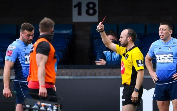
The newest method of reducing the number of head knocks has been to be far stricter around contact and dishing out more red cards. All that’s done in the last 12 months is produce a blizzard of cards – players are still going in far too high.
Lowering the tackle zone even further – I’m for taking it down to mid-chest if not all the way to the waist – should mean far fewer forearms and shoulders hitting heads with force.
The only “complaint” I’ve heard is that it will result in much more off-loading. Struggling to see any downside in that at all.