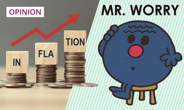
“Inflation numbers are lying to us.”
That was the opening gambit in a LinkedIn post from the CEO of BrewDog. It is social media so, to be fair, it was probably an effort to get some attention. However, I am afraid that Mr Watt is wrong and there is no fake news or sinister government plot.
That said, there was something in his post which appealed to me, as reporting on inflation has been generic and takes no account of the fact that the inflation rate is a very personal matter.
I love a weather analogy, and the best one for inflation is thinking about it like the wind chill factor. The most recent data told us inflation was just below 10%. However, for some of us, this might feel like something much worse. In October, the inflation “wind chill” might make it feel like something closer to 20% or more for some people.
The reasons for us all being impacted by inflation in different ways is simple. Many will know that inflation is calculated by adding up a “typical” basket of goods and services each month, and then assessing how the prices of the basket have moved. This means that, if your own personal basket is different in any given month, then the published rate will not accurately reflect your own inflationary feelings.
There are 12 different groupings included by the Office of National Statistics (ONS) in the basket, each with sub-measures. Across these, there are very different changes which we can observe, and all of this is really quite obvious.
Price impacts are passed to consumers from businesses
In the published data, the smallest changes to our baskets are in healthcare, education and communication (phone and internet) – these are only around 2% increases. However, there are much bigger changes elsewhere.
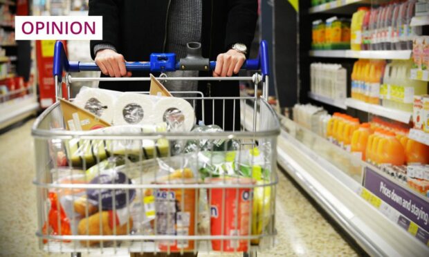
The largest changes can be seen in recreation, food and drink (non-alcoholic), transport, and general housing and household services. The changes here range from 9% to 31%. Thus, if your spend is focused on these core and very basic areas of expenditure, then you are relatively more impacted by inflation.
In turn, this means that, if more of your basket is focused on these areas, then you are relatively worse off. As I have written before, this is why the current inflationary mix is hitting those who are relatively poorest in society, because their basket focuses on these non-discretionary items.
The inflationary impact on the basket is spread across many months. As price changes impact on business, these costs are then passed to consumers.
Check your personal inflation rate
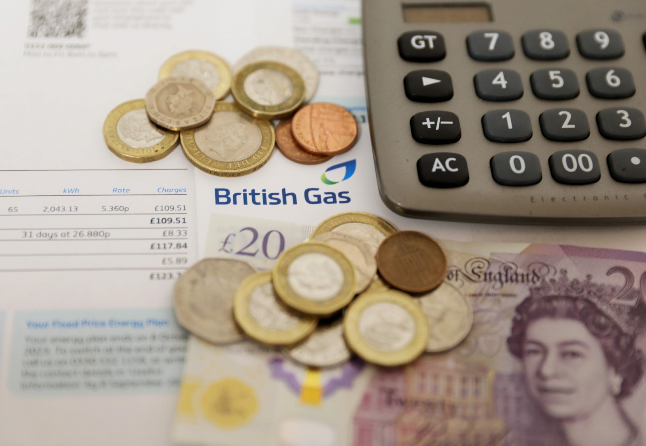
However, we will start to see further changes to consumer inflation once the new energy price cap takes effect. This data won’t be shown until later in 2022, but will be felt in November by consumers, hence the media coverage.
I’d suggest that the housing and household Services category, and potentially the food category, will continue to rise, and these make up nearly a third of the total basket.
BREAKING: Bank of England forecasts that inflation in the UK will peak at 13.3% in October
— The Spectator Index (@spectatorindex) August 4, 2022
I’m not the man to do this, but it would be interesting to see the government present an inflation basket analysis for different income groups. I suggest this would show quite different results, and might help demonstrate better which interventions might be designed to help specific people.
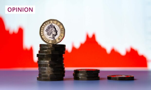
If you want to know your personal inflation rate, you can go to the ONS website and calculate it – it’s worth doing. My personal inflation rate was 3% higher than that published, and I’d bet, for many, yours will be higher, too.
Most of us will feel and be worse off than the data suggest
I suppose this all helps to explain why James Watt was, apart from the headline, correct. Many of us will feel like the Bank of England and governments are lying about inflation.
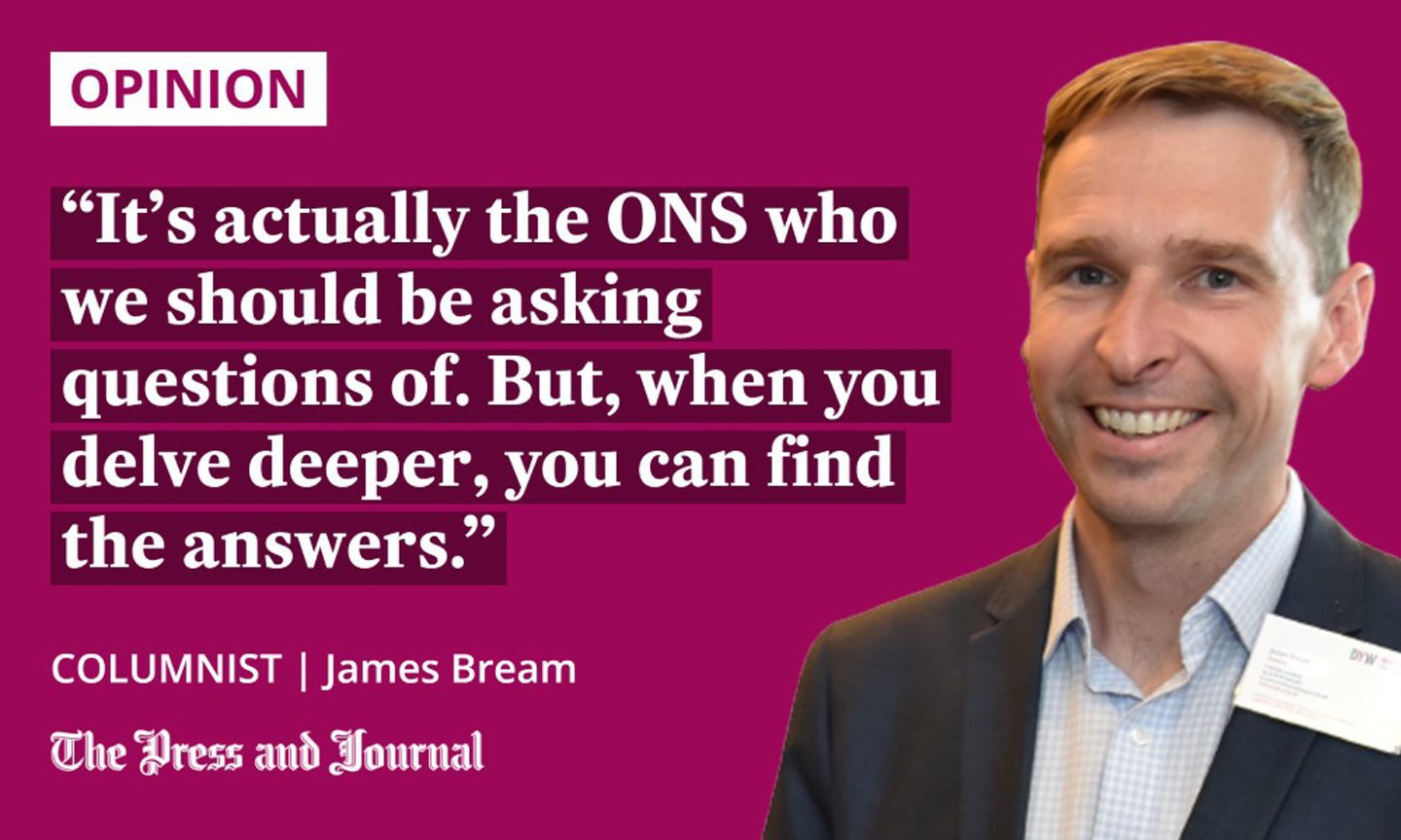
However, its actually the ONS who we should be asking questions of. But, when you delve deeper, you can find the answers.
The inflation numbers are lying to us.
An article I wrote on @LinkedIn – https://t.co/e24YMUPnqy pic.twitter.com/UpJRzTiVv4
— James Watt (@BrewDogJames) August 3, 2022
Without doing much work, I would suggest that most of you reading this will “feel” worse off than the official data suggests, and that you are actually worse off than it says, too.
It is anyone’s guess what happens next with all of this in practice. The future rate of inflation in the next three to four months is actually pretty predictable, and this should give our political leaders all the information they need to make good decisions.
In the meantime, enjoy working out what the wind chill factor is for your household by Googling “personal inflation rate”.
James Bream is CEO of Aberdeen-based Katoni Engineering and chair of DYW North East


Conversation