I got off the bus last week and did a double take to see a woman press a button by a shop and appear to start descending slowly through the pavement.
An exciting new gimmick to help revive our moribund high streets?
Sadly just an optical illusion. A rising security shutter in front of her had created an effect not unlike the disconcerting one where you think your train is moving off but it’s actually the one on the next platform.
Spooky though and it made me think about how our eyes play tricks on us, not least after having spent some of that bus journey putting my finger halfway between two different-looking blocks on my phone screen to see if it really was true they were in fact the same colour.
Bigger text looks smaller mystery
Could something like that explain why several people have been in touch recently to say that the size of the text we use for death notices in print has been made too small for them to read?
It is a complaint that has stumped me a little because my investigations so far on behalf of the people who have written in have established one important fact: the font size used for these family announcements has in fact increased from what it was a few years back.
So if the words are not actually smaller, why are people finding them harder to read?
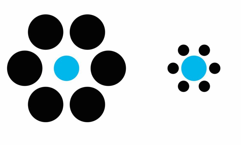
It could be the context they are appearing in. Many of you will have seen examples of how two circles the same size can be made to appear very different just because one is drawn inside a small ring and the other within a large one.
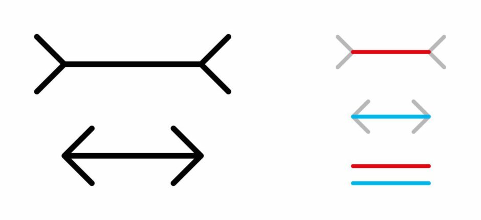
Or two lines which look to all the world to be varying lengths only because of the direction the arrows on the end of them point?
There’s a whole science around this and it might be in play here because some of the other elements that appear around the notices on the page have changed – such as the inclusion of a full-length daily obituary.
Should have gone to…
There’s another tempting answer of course: that they are simply being looked at by older eyes.
Veteran editors tell me these concerns are nothing new and readers have always brought them to us when they really “should have gone to…” one well-known brand of opticians or another.
There’s certainly something in that and there’s no hiding the fact that we count many people enjoying their golden years among our most loyal readers.
But scientific(ish) experiments in the newsroom suggest under-strength glasses are by no means the only issue. A selection of colleagues all picked the more recent pages – with the bigger letters – as the harder of the two to read.
Pinch to zoom in
Many of these guinea pigs are of a generation blissfully unfamiliar with the whole concept of print being too small of course, used to being able to bypass such problems instantly with a simple “pinch out” on a screen.
And the growing numbers – of all ages – subscribing to the e-edition of the paper will mostly be free of any worries on this count too.
That doesn’t though make it any less important to me to get to the bottom of the issue – the ombudsman role was set up to be a helping hand for all readers, no matter how they access our journalism.

I called one of those who had written in this week, a former newsagent as it turned out so very familiar with people’s close relationship with their chosen newspaper. He received a firm promise that I would look into this and see what – if anything – can be done on behalf of everyone who has made the same points.
Hopefully I will make better progress than those monks who march up and up the mind-bending stairs in that famous Escher optical illusion without ever getting anywhere.


Conversation