It’s been a big first year for the Press and Journal data team. The team was put together in March of this year as part of our newsroom restructure and has been busy ever since.
With the end of the year approaching we’ve assembled a list of our favourite data projects from throughout 2021.
World War One remembrance
This was inspired by a dataset found on Aberdeen City Council’s open data site. Spreadsheets with details and addresses for more than 11,000 soldiers across Aberdeen and Dundee were made into an animated ‘scrollytelling’ map and table to pay tribute to those who lost their lives in the First World War. We had the discussion that zoomed out it would look like a field of poppies, which formed the basis for our design for the piece and we wanted to make sure that each person was given a voice so each poppy represented a person. Since publishing, the data team has received a number of emails from family members sharing their stories, some of which we have also shared with readers.
2021 election
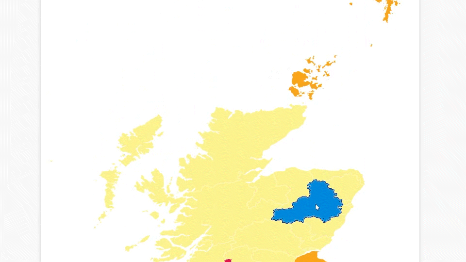
The 2021 Scottish Election was the first big project that the newly formed team worked on. We launched a piece which tracked results as they came in, in real-time. This included a map split into constituencies, which when clicked on, brought up a graph showing the proportion of votes for each party, from the first Scottish Parliament election in 1999 to the most recent in 2021. This was updated as soon as the votes came in, so people could follow along with the latest news and see how seats had changed hands for every single constituency in Scotland, as well as seeing the general picture of how the election was going.
Click here to take a look back at the 2021 election.
Irn Bru scale
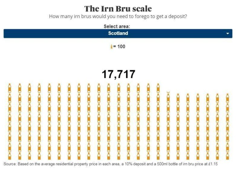
Sometimes our charts come out of fairly deranged team conversations. For this one we were working on a house price tracker and one of the things we discussed was how to put the numbers into perspective. Something that is often done in this context is “how many avocado toasts would a millennial have to forego to save up a deposit” and used that idea as inspiration. There was a lot of discussion as to how to make the chart more relevant to our readers (ie Scottish) – was that pizza crunch? Haggis? In the end we settled on Irn Bru bottles as an easily recognisable icon to use in a chart.
You can see the house price tracker here.
Vaccinations
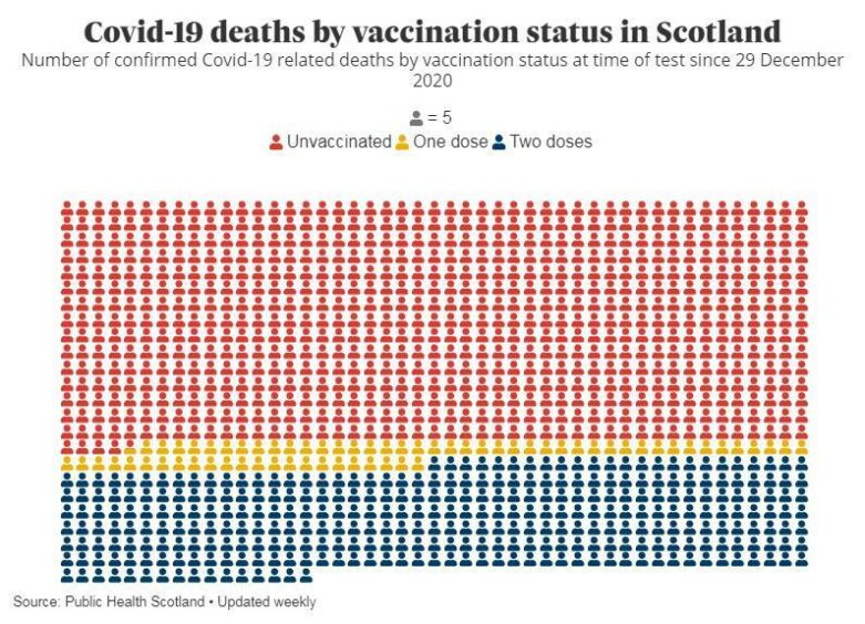
For this one it’s less about the chart and more about the hope it represents. 2020 was filled with so much distressing data and charts and so we were thrilled to get our hands on data on vaccinations in 2021. In January we launched our vaccination rollout tracker, and a few months ago we gave our main Covid tracker an overhaul. One of the things that we added was data on Covid outcomes by vaccine status and as this chart shows, despite (at time of writing) 80% of the population having received a vaccination the majority of the cases that resulted in a loss of life were in the unvaccinated group. This goes some way to show the effectiveness of the vaccination programme.
Click to view our daily updated Covid and vaccination trackers.
Drug deaths
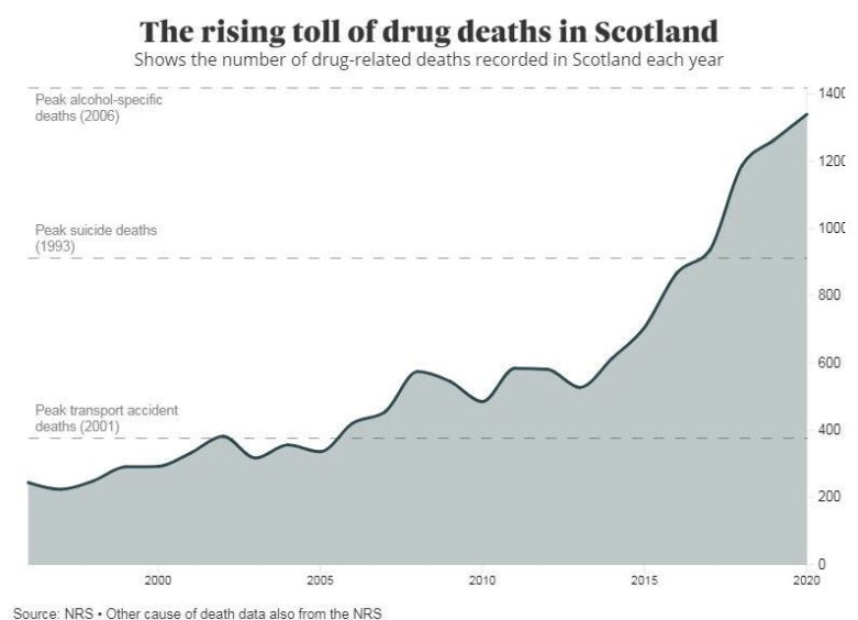
This data is difficult to process each year. It’s such an incalculable loss and difficult to picture in your head the scale of it. Whenever we present data on such a tragic subject our aim is to try and provide some context. For this chart we visualised the scale of the Scottish death toll alongside some other annual records for causes of death.
You can see our full analysis here.
Battle of Beauty Hill
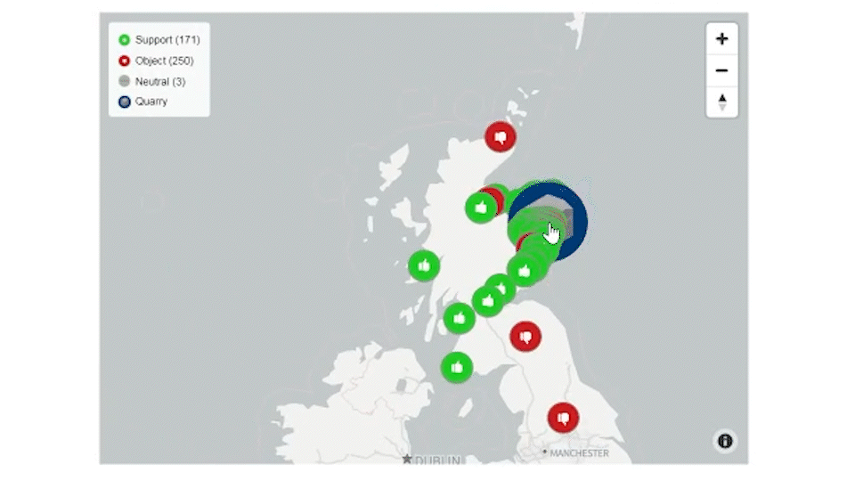
The Battle of Beauty Hill map was a new type of project for the Press and Journal. It was a collaboration with colleagues across the newsroom to produce the final piece. Over 400 planning application comments had to be manually added to a spreadsheet from individual PDFs on Aberdeenshire Council’s website, and then their locations were plotted on a map with markers indicating whether they objected or supported the development. It showed that residents disagreed with the plans while those who were for it lived further away. Readers could also easily see comments made by clicking on each icon. It helped change our views on how to visualise planning application stories, as well as the map telling a story on its own.
You can read the full article here.
Tour of Britain
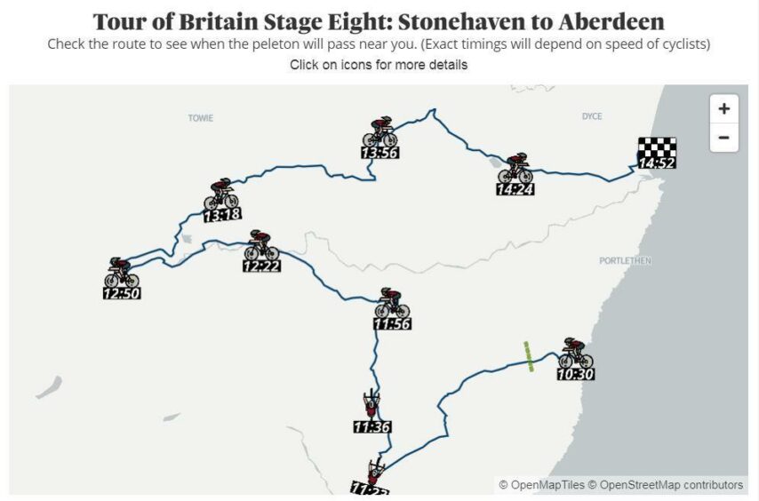
The Tour of Britain visiting Aberdeen was an exciting event in our area, and so we wanted to celebrate it appropriately, creating this map showing the peloton’s expected journey and times. There are some stylistic choices – like making the times look like clocks and having the cyclists facing in the correct direction – that were fun to realise, which is why the map has made it onto this list. It also allowed us to experiment with tracing out our own routes onto maps, something we now use more often.
Stuck in rent
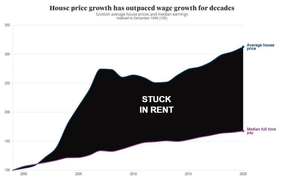
This was created as part of Sean O’Neil of our Impact investigation team’s in depth analysis on why so many people across the region are finding themselves stuck in rented accommodation and unable to get a foot on the housing ladder. We were tasked with creating visualisations to accompany Sean’s analysis. This chart ended up with a very literal visualisation of the ‘doom and gloom’ that many potential buyers find themselves in.
Read the full investigation here.
Needless to say this is only the beginning and we look forward to whatever 2022 brings. If you have any suggestions on subjects you would like to see the data team cover, please get in touch at datateam@dctmedia.co.uk