
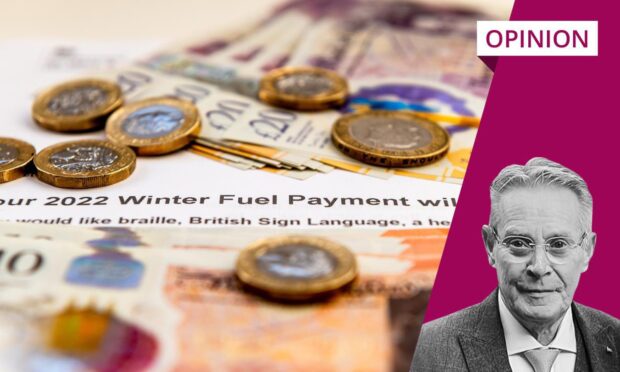
Recently, the media has been full of stories about the latest international education comparison – the so-called Pisa rankings.
The “failings” of Scottish schools were “revealed” as we dropped down the chart in maths, reading and science. However, my reading of the results is at odds with the way they have been reported. I’ve concluded that it says we’re doing OK. Not top of the class, but certainly not bottom.
Yes, we’ve dropped behind a bit, but so has everyone. In fact, there is some good news: despite our obsession with the inequalities of the independent school system, the UK is picked out by the authors as one of the countries where access to education is more equitable.
There are other interesting observations, too – countries which spend more on education don’t always get better results, and good quality teachers matter more than class sizes.
Yet, the conclusion of the Scottish media was very different to mine. And, to understand why, you have to understand the way both the media and the PR industry works.
I can pretty much guarantee that none of the reporters assigned to the Pisa rankings story read the entire 491-page document. The nature of the job nowadays means they would have been lucky to have an hour to digest the main headlines before they were required to file their story and move on to the next deadline.
Most journalists will rely heavily on the summary and press releases written by the PR department of the OECD and Scottish Government. Given that reporters will be acutely aware that they haven’t read the full report themselves, they will use their contacts to find other people who can provide an informed perspective. Those voices would be academics, teachers and senior leaders in the education field.
Headlines written in haste and to hold interest
The only problem is that, unless they’ve had the privilege of knowing that the Pisa report was about to be published and been given an advance copy themselves, these experts will have had little time to digest the findings either.
They will have contacted the PR for their university, council or organisation and asked them to advise whether they should go ahead with the interview, given that they’ve barely had time to read the report. That PR will have probably spotted the opportunity for some good publicity and given lots of encouragement.
They will have done some quick research and sent on the media headlines as background reading which, as we’ve already established, were written in haste. Let’s face it, the PR hasn’t had time to read the original research either, so there’s not much more they can do.
Education Secretary @JennyGilruth has highlighted the improvements to literacy and numeracy in the most recent Achievement of Curriculum for Excellence Levels (ACEL) data during a debate in @ScotParl. pic.twitter.com/2SOq6m8WYv
— ScotGov Education (@ScotGovEdu) December 13, 2023
Then, you’ve got the added pressure of a general public whose interest in news is declining, so headlines need to be punchier than ever in order to capture their interest. “Scottish Schools Generally Doing OK” does not a good headline make.
“Scottish Schools Falling Down the Ranking”? Much better. It’s true, after all, even if it might not give the full picture or reflect more encouraging news.
And let’s throw in a hot potato, like the OECD’s observations about the negative impact of mobile phones (a topic I have written about in the past). This was not, by any means, the main observation in the report, but it’s the “sexy” one, giving rise to engagement through phone-ins and reader comments.
I saw all this in action many times, and was part of it, both during my time on the health beat for BBC Scotland and as the head of communications for a university.
Summaries must tell most important stories
Once, the health secretary at the time, Malcolm Chisholm, asked me if I’d read the full report on the future of the NHS in Scotland, which had been carefully and thoroughly outlined by an eminent clinician. I confessed that I’d only read the summary. He was shocked.
Every time I met him after that, he asked me if I’d read the report yet. Every time, I confessed that I hadn’t. The news agenda moves on quickly, and there simply weren’t enough hours in the day to read the full document I’d just been reporting on, especially when there would be a new document to report on the next day.
If you have children at school, I’d recommend you read the summary on the OECD website, which contains many interesting and encouraging insights
I expect this was one of many depressing reality checks for a minister (and a lesson in the importance of the summary). And, if my confession shocks you, remember that you are probably one of a declining minority who pays for news and, therefore, pays the wages of a reporter. This is why journalists continually have to cover more stories with less time.
As for the remaining analysis of the Pisa rankings: if you have children at school, I’d recommend you read the summary on the OECD website, which contains many interesting and encouraging insights.
Another confession: I got as far as the summary and a few key tables, but not the whole report. Other priorities got in the way again. So, if you are ever compiling a really significant piece of research or a policy document, do you yourself a favour and make sure your summary tells the story you really want to be told.
Eleanor Bradford is a former BBC Scotland health correspondent and now works in communications


Conversation