It took a long time for the Golden Bridge to work its way into the hearts of people in Inverness.
But a decade after it was lifted into place, the figures suggest that it has finally made it.
More than 85,000 pedestrians crossed it in 2022. And a further 48,000 went across on a bike.
That’s not bad going for a structure once dubbed “the bridge to nowhere” by sceptical Invernessians.
Highlands and Islands Enterprise (HIE) was the agency tasked with making the vision for Inverness Campus a reality.
It wasn’t just going to be a new home for the city’s university.
It would bring together businesses, researchers and academics in a single stunning location.
And a key part of the plan was the bridge that was going to link it with active travel routes towards the city centre.
But it’s fair to say not everyone was convinced.
Golden Bridge detractors
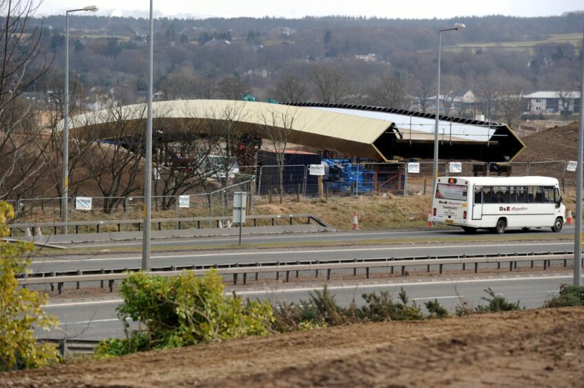
The bridge was lifted into place on April 10, 2013.
Mechanical failures had delayed its unveiling on several occasions.
But the knives were already out among its detractors long before that.
People said it was ugly.
They said it was pointless.
How could public bodies splash so much cash on such an obvious waste of money?
And hey, it’s not even gold.
Yet somehow, it will also cause numerous accidents because the sun shining off of it will blind drivers coming up the A9.
The local community council even lodged an objection to the plans, citing privacy concerns and a fear that it could cause a rise in antisocial behaviour in the Raigmore estate.
Fiery public meetings were held.
Inverness Campus project director Ruaraidh MacNeil was tasked with putting HIE’s case across.
“I’m not the kind of personality that likes to sit on a stage with people shouting at me,” Ruaraidh recalled.
“There were some vocal people in those meetings. We tried to put across our point that instead of negotiating the Raigmore Interchange, they could have this pleasant journey instead.
“By and large, we managed it. I remember being tired at the end of one of the meetings.
“Three of four people who hadn’t spoken up came to me and said they did welcome it.
“And to stick to it. That encouraged me a lot.”
‘We’re really happy with it now’
Munro Ross remembers those meetings.
The chairman of Raigmore Community Council was one of several who was not initially convinced by HIE’s plans.
But looking back now, it’s all worked out rather well.
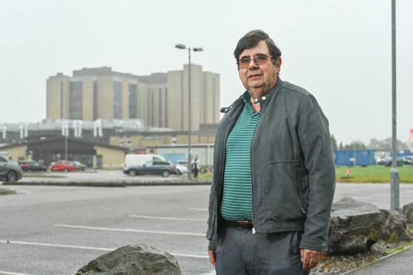
“For a long while, the consensus here was that it was a waste of money,” Munro said.
“It wasn’t well used. When it first opened, you probably saw half a dozen people on it a day if you’re lucky.
“But nobody really discusses it anymore. I mean that in a good way, we’re really happy with it now.”
You could understand some of the concern.
Back in 2013, Inverness Campus was still two years away from opening.
What we effectively had here was a crossing from the Raigmore estate to a fenced-off building site.
But as the campus site took shape, it started to make a bit more sense.
And with the new bridge over the railway line, the whole thing is now connected to Stoneyfield and the Inverness Shopping Park too.
Less golden, more ‘mellow yellow’
There is one criticism that hasn’t faded though.
And that’s the colour of the bridge.
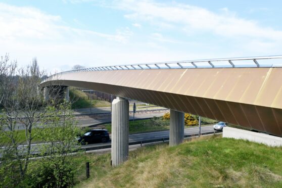
The original artist’s impression of what it would look like is somewhat different to today’s reality.
In the impression, the bridge is glowing so brightly you can understand why the time when people thought everyone would be dazzled and crashing their car was a thing.
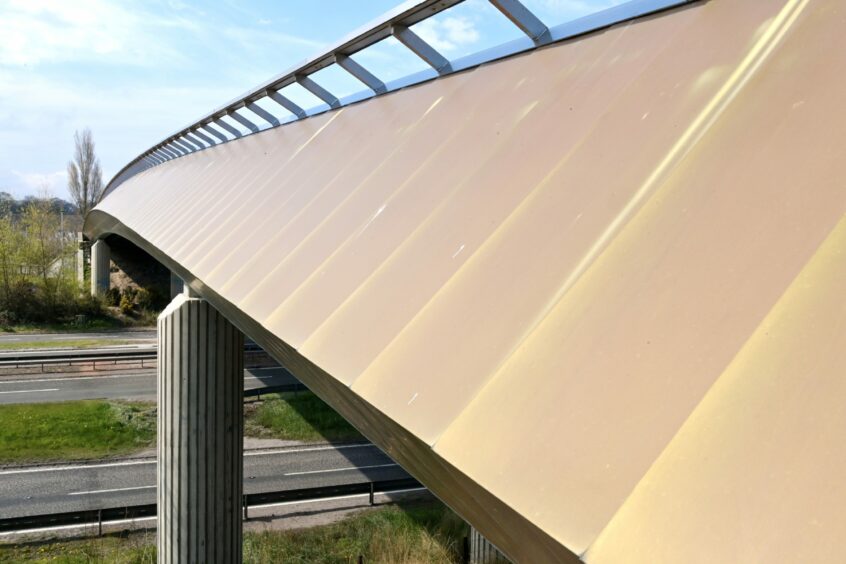
The reality was never quite that bright. And in the last 10 years, it’s definitely lost a lot of its sparkle.
That was always going to be the case.
Ruaraidh said: “We wanted something people could get attached to, and be proud of. We didn’t want it to be a normal concrete bridge.
“When the gold part was shown, it was visually quite stunning. It was said it would fade over time and go something like, a mellow yellow.
“So I wish we had started with the mellow yellow, because the expectation was so high with the gold.”
It wouldn’t have really had the same ring though, would it?
It could return to its original gold colouring, but the expense of bringing it back would be significant.
And it would only last for a couple of years before the work would need to be done again.
735,000 bridge crossings and counting
But that’s OK.
The Highland capital appears to have made peace with the once-maligned structure.
Since counters were permanently installed on the bridge in 2017, 492,000 people have crossed it on foot.
A further 243,000 went across on bikes.
Perhaps there’s even a lesson in here somewhere.
Some developments might produce a furious reaction – but they evaporate over time as the bigger picture becomes clearer.
It isn’t always the case. It’s unlikely that everyone is going to suddenly wake up in a few years and say the Tilting Pier was actually a very good – but misunderstood – idea.
Only time will tell which direction some of Inverness’s other current planning controversies will go.
Are you interested in all the latest news and updates from Inverness? If so, why not join our new Facebook group?




Conversation